Congrats on the ultrawide 😉
The Genesis Collective Web Experience
Crafting an Identity
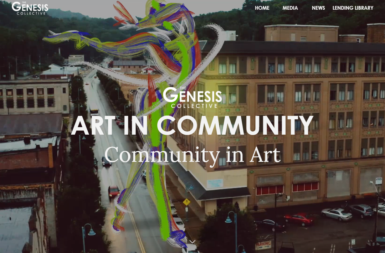
The Genesis Collective is an art collective that exists to support artists and their work in repressed communities around Beaver County, Pennsylvania. Going into this project, it was clear that their web presence would need to reflect the artistry that they are so dedicated to cultivating.
The classic corporate site wasn't going to cut it. The Genesis Collective needed PASSION, STYLE, and UNIQUITY baked into every corner of their website.

FROM
TO
FROM

TO

Playing To Their Strengths
The Collective employs an extremely talented group of artists. To bring out the true genius of this brand, developers and artists would need to work together to combine photography, videography, visual art, and a strong understanding of web content.
To achieve this synthesis, I collaborated to bring The Genesis Collective’s branding and content to the cutting edge. We worked to standardize a typeface, color scheme, and logo that represented the Collective’s modern approach to cultivating art.
Pixel Perfect
The font choice for this project was especially important. We couldn't risk losing the Genesis Collective's signature artsy feel, but we also needed to ensure that anybody could read their message loud and clear.
Century Gothic is bold, unabashed, and easy to read. Exactly what The Genesis Collective needed for text that had to pop.
Lora is a subtle font that harkens back to the Collective's classical roots. It is simple, clean, and easy to read.
Header 1
Header 2
Header 3
Header 4
Header 5
Header 6
Paragraph

Ensuring Compatibility Across All Devices
It was essential to make sure that nobody was turned away from the website due to poor mobile compatibility. We optimized every page for maximum accessibility, no matter what device or internet speed the end user may be using. Images, text, and video were similarly designed for the ultimate mobile experience.

An eye towards the future
Working with The Genesis Collective's interdisciplinary talent was an extremely rewarding experience. Being able to build a site with such high quality audio, video, art, and more allowed for a striking final product. It is not lost on me that The Genesis Collective's dedication to artistry is rare. Thankfully, we already plan to expand the site to include more media, information, and resources for artists. We also hope to build further immersive web experiences that really show off the potential of art + web.
Technical
The Genesis Collective website presented a technical challenge that I was not prepared for - scale. While I tend to use React for client sites, The Genesis Collective needed a CMS backend to be able to edit content as it became available. Furthermore, React.js is amazing for many things, but a website with loads of dynamic content would struggle with SEO. For this reason, I decided to use Next.js and Netlify CMS (deployed on netlify as well) to run the site. The advantages of this stack are that it would not require me to write a server for the site, it would allow me to re-use my React code for the front end (with some minor alterations), and I could have a CMS for the site's admins to use authenticate through GitHub. On top of that, each page could be individually indexed and optimized for SEO without having to employ any complicated router hacks.
Throughout this project I used vanilla CSS for front-end design. My biggest mistake was my approach to CSS - When I began working on the page in React initially, I did not do so with CSS modules in mind. When I switched to Next.js, I had to make the tricky decision whether or not to adapt the existing stylesheet to work with css modules, or keep it as is and work out any conflicts from globally accessible stylesheets. I went with the former, but this turned out to be more trouble than it was worth. In the future, I will absolutely prioritize CSS modules and, if I believe it will save me time, begin to use a CSS pre-processor like SASS.
This site was my second major client project, and I learned some valuable lessons in the process of developing it. Many of these lessons were simply related to my workflow and my development stack - subsequent websites have been much easier to build out because I became familiar with the processes required to make optimized pages in Next.js. But the more valuable lessons came from managing the relationship between myself and my client. Working with their art team also left me with some valuable insight for future collaboration with media professionals. Overall, working on The Genesis Collective's site was extremely rewarding, and I look forward to working with them again in the future.
